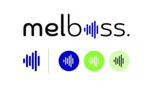
Today we are introducing our new logo. It comes hand by hand with other novelties in Melboss and in the music industry, which we will be sharing very soon.
With the rebranding, we aimed to show an evolution of the original identity, but with a more accurate and conscious redesign of what Melboss is today. We wanted to represent our present and where we are moving forward. Stick around for all the details!
A necessary background in the creation of the new logo.
The music industry is an ever changing industry. New rules, strategies and formulas appear everyday as for platforms where the music industry coexists. Keeping up is a challenge, it requires plenty of resources, whether you are an artist, an organization or you intervene somehow in the industry.
At Melboss, we are aware of how necessary it is to change the way the music industry is offering opportunities to artists. Our goal is to minimize these challenges with orientation and counseling thanks to our team of experts. We take music to a global stage, connecting with fans around the world and helping artists take the necessary steps to elevate their careers. In the meantime, we are also having fun doing it.
We needed to represent this in our logo: A dedicated and strong team recognized by the industry who promotes your music professionally by using the most advanced technologies for you to reach your full potential. Melboss elevates artist´s musical career.
As a consequence, we arrived at our claim: Elevate your music career. Our new logo had to represent elevation, success. It had to raise the volume for artists.
- Starting with the concept
Our past logo was failing to fully represent the closeness that is felt in Melboss, both in the team and with customers.

As a consequence, our goal was to create more close, familiar and friendly proposals. This, also accompanied by a new set of colors that would help transmit energy and musicality. Basically, a logo that would mirror what Melboss is today and where it is headed.
In order to represent this, our first step was to look for rounded shapes: they are much more friendly and it is something that our logo did not have.
As for the color palette, the proposal was to look for striking colors that had the energy we breathe everyday in our workspace, the energy that music is capable of generating. We wanted to perceive newness, freshness, and a youthful air with our logo.

- The Evolution
At first, the idea was to look for proposals that were more groundbreaking, designs that would set a “before and after” in the way we communicated our identity. The images below are some of the initial proposals.
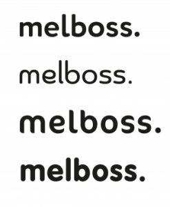
In this sense, one challenge was finding a typeface that would also fit perfectly. In that search, the main element that was clear to us was to work with curved friendly shapes and rounded corners.
There were many proposals but we came to the conclusion that the path was to maintain the nature of Melboss, sticking to our original icon as the base but adding that essence that was missing: a closer aesthetic and elevation perception, rounded bars, more striking colors, more energy.
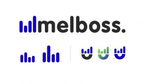
Another important stage during the evolution of the logo was defining how to use the icon optimally: if it was going to be part of the O in Melboss or if it would only be used independently, and in that process there were also several proposals and tests.
- Challenges faced in the redesign process
The main challenge in creating the new logo was finding the perfect way to represent Melboss and what we wanted to convey with the rebranding process. There was a lot of work on new proposals that had nothing to do with the previous identity, and it was somehow discouraging to see how all those proposals were falling apart, because none of them convinced us.
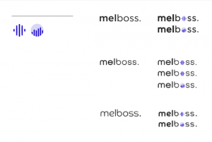
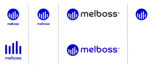
However, we would not have arrived to where we are now without these other proposals.The aim to create something disruptive made us realize that it would not represent evolution, it would have meant a separation from our past and what got us where we are now.
We decided that it was important to stick with the basics of our icon and transform it with a more fresh and friendly air. We kept the circle with bars, it was the best way to represent evolution, starting with what was already there, but representing everything that has been gained and built along the way.
Once we reached that conclusion everything was easier, the path was clearer.
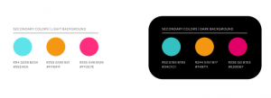
Then came the challenge of choosing the color palette, that perfect color combination that represents what Melboss is. Afterall, color is what gives identities the final touch.
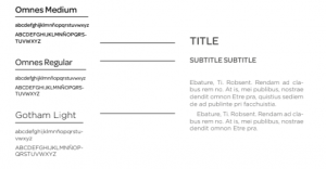
Another challenge was choosing typography. Although we had a marked style of roundness and letters that must transmit kindness, there are millions of typographies out there, with tons of small details. These details count, every element used in design has a purpose, so finding the perfect typo was definitely a challenge. It was a bit of a “trial and error” process until we got to the final product, which we are very happy with.

The result is an elegant but friendly, striking blue logo that captures our essence, it has musicality and it also remarks a new stage Melboss is arriving at, stay tuned for more news!

